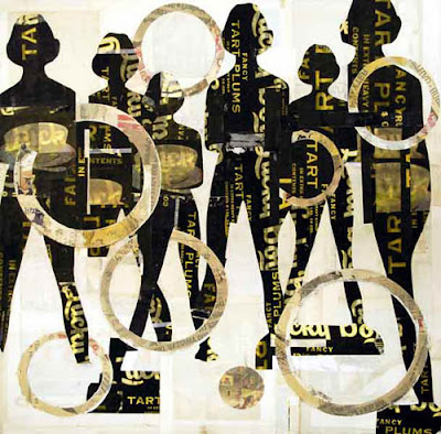
I ran across a blog review of my work which is well written and interesting. The rest of the blog is also definitely worth checking out. Written by Todd Richardson out of Boston and full of interesting posts about typography, photography, arts and music.
Article and blog are here.
Friday, February 27, 2009
Wednesday, February 25, 2009
Wedding themed illustrations by Donna Wilson.
My friend, Donna Wilson has just updated her wedding themed website and you should go check it out. Donna's work combines sophisticated illustration, beautiful patterns and playful color with a personal twist.
Donna's artwork offers classic, offbeat and alternative wedding illustrations and stationary embracing diversity, from ethnicity to lifestyle.
Donna and I were classmates at Parsons and have managed to keep in touch despite our hectic work schedules. We make a regular yearly outing to the Affordable Art Fair when it opens in Manhattan!
You can see more of her work here and here.
Labels:
Donna Wilson,
Illustration,
Parsons,
Patterns,
Wedding themed
Sunday, February 22, 2009
Jane Maxwell art opening at Caldwell Snyder in San Francisco.
On March 5, 2009 Jane Maxwell will have an art opening of her new work at Caldwell Snyder Gallery in San Francisco. Jane and I used to show together at Hubert Gallery in New York and have a mutual admiration for each others work.
Jane's work uses layers of vintage fruit crate labels collaged with encaustic and paint on panel. Her subject is the female form and her concept deals with the female self body image and the feminine ideal in our culture.
Jane's use of the female form has hints of the Vargas girls of the 1940's. I especially love her tongue in cheek use of type in the fruit labels to make reference to women's body parts.
You can see more of Jane's work here and here.
"Tarts and Circles" 48" x 48"
"3 Girls Walking" 36" x 36"
"Our Pick" 36" x 36"
"Red Apples" 48" x 48"
"Santa Barbara Lemons" 40" x 60"
"Oranges and Circles" 36" x 48"
"Walking Girls" 48" x 60"
Shepard Fairey exhibit "Supply and Demand" at ICA Boston.
February 6, 2009 marks the opening for Shepard Fairey's art exhibit at the ICA in Boston. The exhibit serves as a retrospective for Fairey's work over the past two decades and he has also been invited to make art in several public spaces around the Boston area.
Fairey's work needs no introduction. It is pure and the message is clear. His influences range from Russian constructivist propoganda posters to the pop sensibility of Andy Warhol to the urban environment and he cultivates it all into a clean vision that is clearly all his own.
Noone has captured the attention of art critics as Fairey has in recent memory. His work speaks to our generation in a way that punk rock spoke to us in the early 80's. It is a call to question everything. Our government, our police force, our environment and most importantly, ourselves.
You can see more of his work here.
ICA Boston website is here.
Tuesday, February 17, 2009
Anthony Georgis Photography Show at Life + Limb in Portland.
My friend, Molly Quan opened up her store, Life + Limb, last year and it has been getting rave reviews. Life + Limb focuses on
rare plants and modern home accessories. She has done a great job at offering unique and interesting product as well as great artwork.
This month Life + Limb features the photography of Anthony Georgis. Georgis' photographs are dreamy and beautiful. They are quiet and serene as they capture warm light and breeze through an open door, a perfect day at the beach or a bad day in the rain. The show runs through the end of February so go check them out if you are around.
Life + Limb website is here.
See more of Anthony Georgis' work here and here.
Labels:
Anthony Georgis,
Housewares,
Life + Limb,
Modern Design,
Molly Quan,
Oregon,
Photography,
Portland,
Rare Plants
The artwork of Mark Bradford.
Mark Bradford makes lush, beautiful collages that act as imaginary maps. I was able to see his large scale works at The New Museum in New York and the ICA in Boston and they are incredibly detailed works of art.
Bradford’s abstractions unite high art and popular culture as unorthodox tableaux of unequivocal beauty. Working in both paint and collage, Bradford incorporates elements from his daily life into his canvases: remnants of found posters and billboards, graffitied stencils and logos, and hairdresser’s permanent endpapers he’s collected from his other profession as a stylist.
You can see his work here and here.
Labels:
Collage,
ICA,
Maps,
Mark Bradford,
New Museum,
PBS,
Sikkema Jenkins Gallery
Monday, February 9, 2009
The artwork of Richard Klein at Caran Golden Fine Art.
I recently went on a Chelsea art walk and came across the work of Richard Klein at Caran Golden Fine Art. This is a two person show with Julie Rofman.
Klein's newest body of work expands on his ongoing investigation of the physical versus the immaterial. Primarily utilizing found glass objects, beginning with his signature eyeglass lenses, the artist’s pallet has expanded from the purely optical to components such as ashtrays, jar lids, speakers. Strategically placed corporate logos bring an additional dimension to the conceptual depth of Klein’s work.
I was blown away by the beauty of Klein's sculptures. The way that they sit within the space and capture the light against the wall is stunning. My favorite piece in the show is "Transparency" which is the piece you are confronted with upon entering the gallery. The show runs through February 21, 2009 so there is still time to go see the works.
Caran Golden Fine Art website is here.
"Transparency"
"Two Trains"
"Black Friday"
"Blown"
"Cataract II"
"Mantleform for R.M."
The artwork of Vik Muniz.
Unfortunately I missed Vik Muniz's "Verso" show at Sikkema Jenkins & Co. in Chelsea, but I was able to see the catalogue of the work. Not only is the concept brilliant but the execution is flawless. Muniz recreated the backs of some of the worlds most famous paintings with every detail intact right down to the yellowing of the aged labels from different museums. It includes all of the scars and travel history that one never gets to see because it is on the unseen side.
Here is a brief statement of the work:
"Whenever someone wants to see if an artwork is 'real', the first gesture is to look at its back or at it's base; the part of it that normally isn't visible to anyone else but experts, dealers, museum conservators or the artists' themselves. This happens because while the image's objective is to remain eternally the same, its support is constantly changing, telling its story, showing its scars, its labels and periodic clichés. So when a cousin of mine told me his 7-year old could paint a Picasso, I told him 'probably, but he couldn't do the back'. As a teenager, I used to fix the neighbor's TV as a hobby. I wanted to learn how to fix clocks too. Whenever something's function is basically visual, there is always an opening in the back for the curious to do it damage."
Artist website
"Starry Night"
"Woman Ironing"
"A Sunday on La Grande Jatte"
"The New President"
"Jesse Owens"
Installation view at Sikkema Jenkins & Co
Sunday, February 8, 2009
The artwork of Jay Kelly.
I have followed the work of Jay Kelly for a few years now. We have both shown at the same galleries in the past and I have always loved his work. Kelly's art combines multiple image collaged with contrasting type to evoke emotion. His words hint at the larger picture while his images are meant to tell the more intimate details of the story. He uses his own photography as well as printed material, paint and resin to create his art.
What I like best about his art is that there is a contemporary sensibility to it but there is also a nostalgic element that draws me in to read further into the pieces. His use of typography shows his roots of graphic design and I feel adds to the strength of his composition.
Kelly is currently showing at Phoenix Gallery in beautiful Park City, Utah.
You can see more of his work here and here.
"Quest (This will be the beginning)" 48" x 48"
"Mountain (Find your way again)" 24" x 24"
"Golden (From just above)" 24" x 36"
"Remember (I'm always here)" 24" x 24"
"Quest (Will not settle)" 45" x 36"
"History (A strong desire to)" 36" x 24"
Labels:
California,
Collage,
Jay Kelly,
Nostalgia,
Photography,
Resin,
Surf,
Typography,
Venice
Subscribe to:
Posts (Atom)